
Member Profile Customization (Profile Property Manager)
BoardCloud allows you to add as many custom properties to your default user profile as you require.
The system is delivered with a few custom properties that are pre-set.
They can be seen below in the image of the Profile Property Manager:
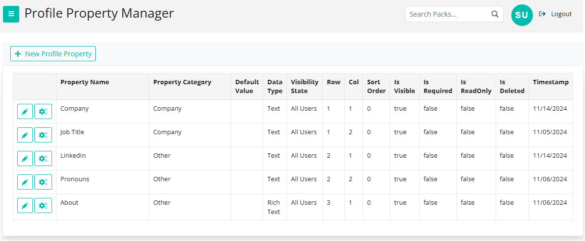
You can also edit the pre-set properties. To do so, click on the pencil icon next to the name of the field (on the left hand side) A screen will pop up where you can change some of the details. (The pop-up will be called Add Property) Note: Some of the details will be fixed and therefor cannot be changed.
Adding a Custom Property
Select the +New Profile Property button to open the Add Property Window. The Add Property window allows administrators to create custom data fields for user profiles. Use this window to define the exact format of the data collected, restrict visibility by user role, and control where the field appears on the screen.
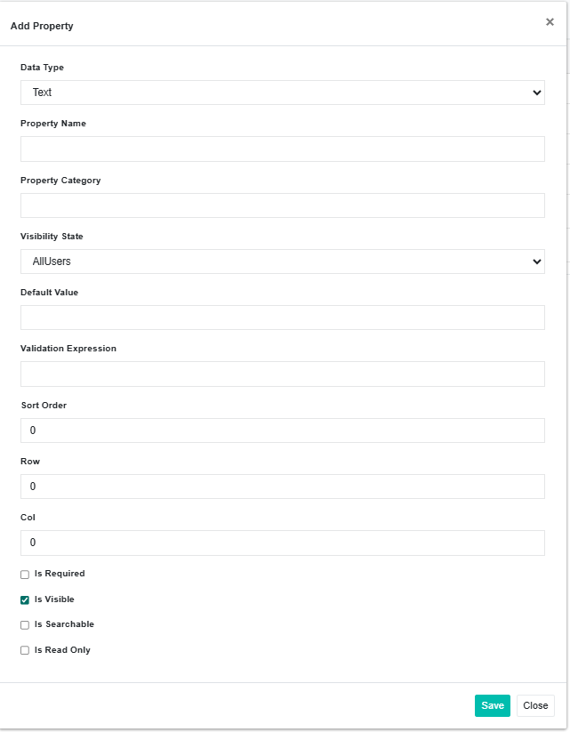
Core Property Details
|
Field |
Description |
Options / Examples |
|
Data Type |
Defines the input format and validation behavior for the field |
See the Available Data Types table below for all 14 options. |
|
Property Name |
The unique label or identifier displayed for this field. |
Keep names clear and concise (e.g., Department, Employee ID, or LinkedIn URL). |
|
Property Category |
Groups related properties together under a shared section header on the form. |
Enter an existing category name (e.g., Contact Info, Address) or type a new name to create a new section. |
|
Visibility State |
Controls which user roles have permission to view this field. |
• AllUsers (Default): Visible to everyone with access to the record. • Members Only: Visible to registered members and higher roles. • Editors Only: Visible only to users with editing privileges and Admins. • Admins Only: Restricted strictly to system administrators. |
1. Available Data Types
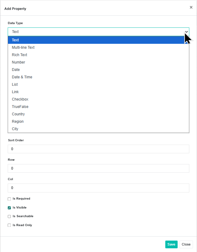
Selecting the right Data Type ensures users enter clean, standardized information:
-
Text Inputs:
-
Text (Default): A single-line text box for short entries like names, titles, or IDs.
-
Multi-line Text: A larger text area for multi-sentence notes, descriptions, or comments.
-
Rich Text: A text editor supporting formatting (bold, italics, lists, and styling).
-
Numbers, Dates & Links:
-
Number: Restricts input to numerical values.
-
Date: Provides a calendar picker for selecting a specific date.
-
Date & Time: Captures both a calendar date and a specific timestamp.
-
Link: Formats the input as a clickable hyperlink or web URL.
-
Selections & Toggles:
-
List: Creates a selectable dropdown list of predefined options.
-
Checkbox: Displays a checkable box for opt-ins or acknowledgments.
-
TrueFalse: Provides a binary True/False (or Yes/No) selector.
-
Location Fields:
-
Country: Standardized selector for countries.
-
Region: Standardized selector for states, provinces, or territories.
-
City: Field for capturing city or municipality names.
2. Values & Validation
-
Default Value: Pre-fills the field with a standard value whenever a new record is created. Leave blank if you want the field to start empty.
-
Validation Expression: Restricts what users can enter using a custom validation rule or Regular Expression (Regex). Use this to enforce specific patterns like phone number formats, postal codes, or custom ID structures. Leave blank if no special formatting is required.
3. Form Layout & Positioning
These numerical fields control where the property renders on the screen:
-
Sort Order: Determines the vertical sequence in which properties appear within their category (defaults to 0). Lower numbers appear higher on the page (e.g., 1 appears before 2).
-
Row: Assigns the property to a specific horizontal row on multi-column forms (defaults to 0).
-
Col: Assigns the property to a specific vertical column within that row (defaults to 0).
4. Property Behavior Options
Use the checkboxes at the bottom of the window to control how the field behaves on the form:
-
Is Required: Forces the user to complete this field before they can save the form.
-
Is Visible: Controls whether the field is actively displayed on the form (checked by default). Uncheck this to hide a property on the front end without deleting its stored data.
-
Is Searchable: Indexes this field so users can find records by typing this property's value into the search bar.
-
Is Read Only: Displays the field and its value to permitted users, but prevents them from editing it.
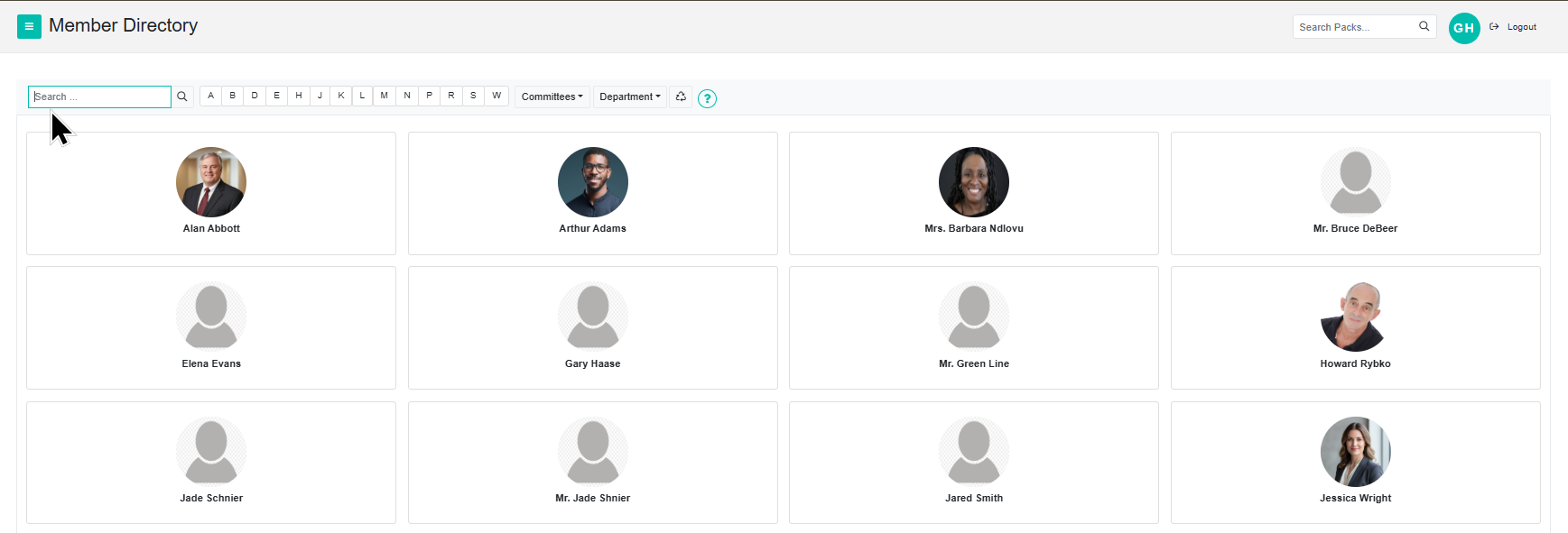
By making the record searchable you can now search by property in the Member Directory
There is a great example of adding new properties on this blog post.
Please contact us if you need assistance with this section.